
TOPIC
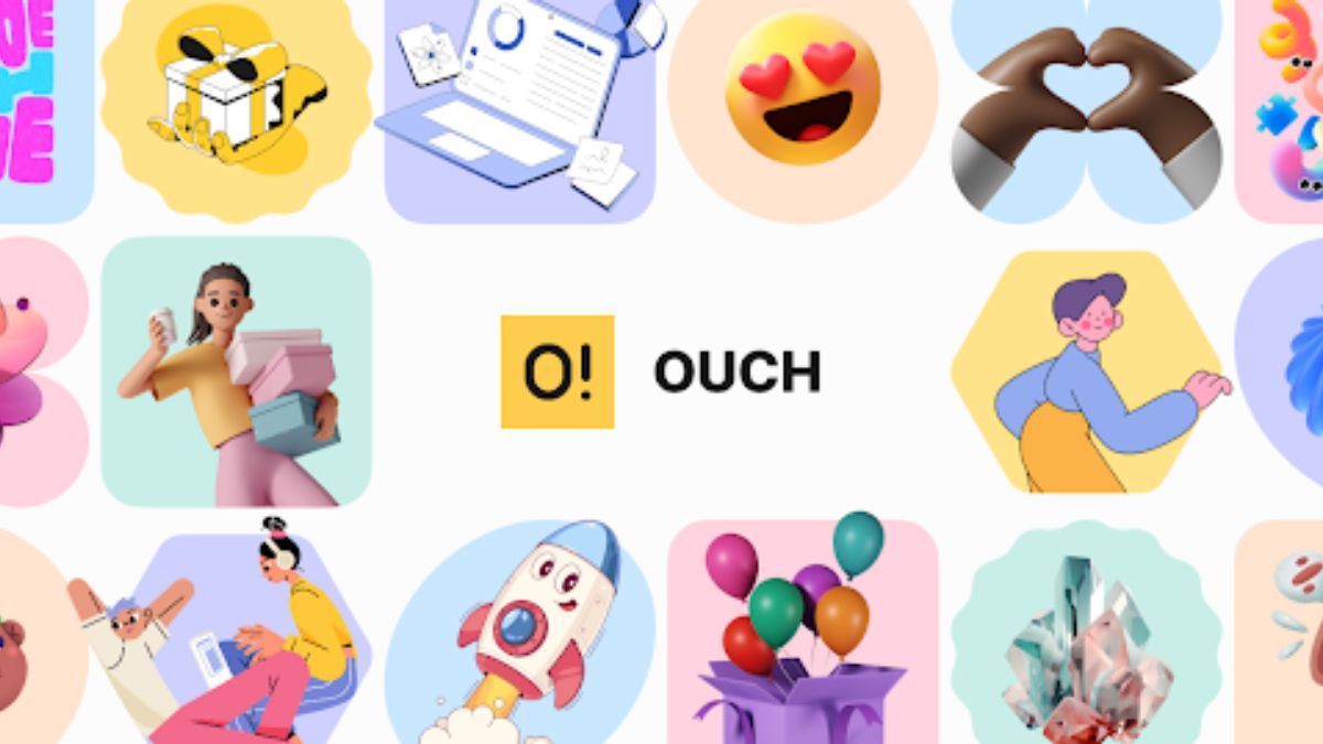
Ouch Illustrations: A Designer’s Field Notes After Two Years of Use
I spilled coffee on my keyboard at 2AM while frantically trying to finish a client project. The deadline loomed just hours away, but something felt off about the design. It looked… empty. Professional, sure, but soulless.
My designer friend texted: “Try Ouch by Icons8.”
That desperate coffee-stained night kicked off my two-year journey with this illustration resource. Not always smooth sailing, but educational as hell. These are my unfiltered notes from the trenches—what worked, what failed miserably, and what I wish someone had told me before I started.
The Origin Story (Because Context Matters)
Remember those dark days when every startup website looked identical? Smiling people pointing at laptops, geometric patterns, and that same damn hero image everyone used? Design got boring.
Icons8 launched Ouch as a side project around 2018. Back then it was barely 300 illustrations. I discovered it while tackling the most soul-crushing project imaginable—redesigning an insurance claims portal. Try making “deductible verification” feel friendly. Just try.
We’d gone through countless stock photos. Bland. Abstract shapes? Confusing. Then I dropped in some quirky illustrations of people navigating paperwork mazes, and suddenly our client stopped checking his phone during presentations.
What’s Actually In The Box
Let me break down what Ouch offers without the marketing fluff:
- PNG files (free with attribution)
- SVG vectors (paid subscription)
- Animated options (GIFs, MOV files, Lottie JSON for developers)
- 3D stuff if you’re into that
- Some editing capabilities through their Mega Creator
The organization system isn’t perfect but beats most alternatives. You filter by style, subject, purpose, or mood. Sometimes the categories make zero sense (“Why is this under ‘success’ and not ‘achievement’?”), but you’ll eventually find what you need after some digging.
The modular nature of many illustrations saved my ass last spring. A fintech startup needed to show a 5-step investment process across their app. Instead of hunting for 5 perfectly matched illustrations that didn’t exist, I grabbed one base composition and swapped elements to create a coherent sequence. Client thought I’d custom-designed everything. I didn’t correct them.
The Brain Science Behind Why This Stuff Actually Works
There’s legitimate cognitive research explaining why illustrations matter. Our prehistoric brains process visuals roughly 60,000 times faster than text. We evolved to instantly recognize threats and opportunities through visual patterns, not to read terms of service agreements.
I’ve witnessed this repeatedly in usability testing:
- Emotional processing happens faster. During a healthcare portal redesign, patients kept abandoning forms halfway through. We added illustrations showing a patient journey with emotional touchpoints, and completion rates jumped. Users reported feeling “guided” rather than “processed.”
- Complex concepts become digestible. For a retirement planning app, we tested explanation methods. Text-only instructions confused users and took forever to understand. Adding strategic visuals cut comprehension time dramatically and improved retention.
- Abstract ideas become concrete. An enterprise software onboarding sequence was failing because nobody understood jargon like “integration parameters” and “workflow configuration.” Visual metaphors instantly clarified these concepts, and support tickets plummeted.
- Attention gets directed predictably. Eye-tracking studies don’t lie—humans follow visual pathways in relatively predictable patterns. This helps guide attention toward critical interface elements that might otherwise get lost.
Spectacular Failures That Taught Me Everything
Let me tell you about my worst illustration disaster because it taught me more than any success.
I was redesigning an investment platform for first-time investors. The client wanted something “approachable” and “not intimidating.” I went overboard, scattering playful cartoon-style illustrations throughout the serious financial interface.
The client loved it. The actual users? They were horrified. During testing, one participant said—and I’ll never forget this—”This looks like my kid’s game. I wouldn’t trust it with my money.” Brutal, but fair.
That expensive mistake taught me several painful lessons:
- Context trumps coolness every time. What works brilliantly on a creative agency’s website can absolutely tank credibility on a financial platform. I now ask what the visual needs to accomplish before considering style.
- Less is more, seriously. Early in my career, I’d jam illustrations into every available space. Now I treat them like expensive spices—a little goes a long way.
- Test with normal humans. What seems obvious to designers often baffles regular people. I’ve watched users stare blankly at illustrations I thought were crystal clear.
- Cultural context matters. I once used a thumbs-up gesture in an illustration for an international product. Turns out that’s offensive in several countries. Awkward client call ensued.
- Build systems, not collections. Random unconnected illustrations create visual chaos. Creating guidelines for style, placement, and purpose ensures everything feels intentional rather than scattered.
Who Gets Actual Value From This Stuff?
UX/UI People In The Trenches
For interface designers like me, illustrations solve specific functional problems:
- Empty states that need personality without distraction
- Error messages that need to feel less frustrating
- Onboarding sequences that need to simplify complexity
- Features that are too abstract to explain in words
- Brand personality that needs reinforcement
Last summer I redesigned an e-commerce checkout that had a 47% abandonment rate. By adding illustrated progress indicators showing the same character moving through a journey (cart → shipping → payment → confirmation), completion increased substantially. Users reported feeling “accompanied” through the process rather than abandoned.
Content & Marketing Folks
Marketing teams face different challenges than product designers. They need visuals that:
- Stop the endless social media scroll
- Explain complex value propositions quickly
- Look consistent across multiple platforms
- Can be produced yesterday because marketing timelines are insane
- Don’t look like the same generic crap everyone uses
For a client’s content marketing campaign, we created a template where key elements could be swapped while maintaining the overall style. This let them produce visuals for a 12-part educational series in about a quarter of the time custom work would have taken.
Developers Who Hate Playing Designer
Most developers I work with want visual assets that:
- Just work without technical headaches
- Don’t require opening design software they despise
- Scale properly across screen sizes
- Don’t tank performance or loading speeds
- Look decent without requiring design skills
The handoff experience has been mostly smooth. SVG files are clean, animated options provide fallbacks for different technical constraints, and most developers appreciate having ready-to-implement visuals.
Real-World Workflow Integration
A resource is only as good as how it fits into actual work. I’ve used Ouch through:
- Their website (for quick browsing)
- The desktop app (for organizing project assets)
- The editor (when customization is needed)
The desktop application has been surprisingly useful for client work where I need to maintain visual consistency across months-long projects. The organization system makes it relatively easy to find that illustration I used six weeks ago that suddenly needs a variation.
Making Learning Not Suck
I occasionally teach design workshops, and quality visuals dramatically affect engagement. I’ve used these illustrations for:
- Explaining abstract UX concepts to beginners
- Creating slides people actually pay attention to
- Visualizing personas and journey maps in workshops
- Developing handouts people reference later
- Breaking up walls of instructional text
The difference in student engagement between text-heavy materials and visually-supported content is jaw-dropping. I’ve literally watched people’s eyes glaze over with text, then suddenly perk up when the same concept includes relevant visuals.
Startup Survival Visual Kit
Early-stage companies often operate on impossible budgets while competing against established players. For these teams, quality business clipart becomes essential. I’ve watched startups transform from “obviously made in someone’s garage” to “looks like a legitimate company” largely through strategic visual implementation.
One D2C startup I advised couldn’t afford custom illustration or photography. We cobbled together their initial visual identity using modified stock illustrations, creating a consistent look across their website, pitch deck, and social channels. The visual coherence helped them appear established enough to secure their initial funding round.
For cash-strapped organizations, illustration libraries provide:
- Professional-looking visuals without dedicated design staff
- Consistent branding across touchpoints
- Quick production for urgent marketing needs
- Adaptable assets that evolve with the business
- Predictable costs versus custom commissioning
The subscription model makes more sense than commissioning custom illustrations for every need, especially when brand identity might still evolve significantly.
Quality Assessment From Someone Who’s Tried Everything
After working with numerous visual resources over the years, I judge quality through specific criteria:
- Artist involvement. Icons8 works with professional illustrators rather than crowdsourcing, which generally produces more consistent quality.
- Style coherence. Each collection maintains internal consistency in proportions, detail level, and stylistic choices.
- Technical preparation. Files come properly organized for digital implementation, with sensible layer structure in vector formats.
- Contemporary relevance. The library updates regularly with new styles reflecting current design trends.
- Contextual adaptability. Some collections work across numerous contexts, while others are too specific to be widely useful.
That said, there’s an undeniable difference between stock illustrations and custom work. It’s like the difference between buying clothes off the rack versus having them custom-made—both can look good, but one is specifically created for your exact requirements.
Implementation Secrets Nobody Tells You
Through painful trial and error, I’ve learned several implementation tricks:
- Match complexity to audience. Technical audiences can handle detailed, information-dense illustrations. General audiences need simpler, more iconic approaches.
- Always adjust colors. Default color schemes rarely match your brand perfectly. Taking time to customize colors makes stock illustrations look significantly more integrated.
- Create consistent framing. How illustrations are positioned affects their relationship to surrounding content. Consistent framing (backgrounds, borders, spacing) creates visual harmony.
- Plan for mobile first. Illustrations that look amazing on desktop often become unrecognizable blobs on smaller screens. Test at different sizes before implementation.
- Prioritize function over aesthetics. The biggest mistake? Choosing illustrations because they look cool rather than because they communicate effectively. Always ask: “Does this actually clarify the message?”
Competitive Landscape Reality Check
I’ve worked with most major illustration resources available. Compared to alternatives, Ouch offers:
- Better style consistency within collections
- More intuitive categorization and search
- Better format options, especially for animation
- Stronger integration with other design tools
- More frequent updates with contemporary styles
Where it falls short: If you need highly specialized industry illustrations (like detailed medical procedures or specific industrial processes), you’ll still need significant modification or custom work.
The Honest Downsides
No resource is perfect for every situation. Potential users should know:
- Free usage requires attribution, which isn’t always feasible
- Other companies can use identical illustrations
- Each style collection has inherent limitations
- Popular illustrations become increasingly recognizable
- Customization tools have a learning curve
I’ve had the awkward experience of seeing a client’s competitor using the exact same illustrations in their marketing. While customization helps differentiate implementations, the underlying visual structure remains recognizable. For markets where unique visual identity is crucial, this represents a legitimate concern.
Measuring Real Impact Beyond Looking Pretty
The true test of any visual resource is measurable impact. Through client projects, I’ve observed:
- Comprehension improvements: Feature adoption increases when complex functionality is visually explained
- Engagement metrics: Session duration and interaction depth often increase with strategic illustration implementation
- Conversion influence: Completion rates for critical user actions improve with visual guidance
- Brand perception shifts: User research reveals changed perceptions of key brand attributes after illustration system implementation
- Support reductions: Help requests decrease when processes have visual explanations
These quantifiable outcomes provide justification beyond subjective aesthetic preferences.
Visual Strategy: The Stuff Nobody Talks About
In increasingly crowded digital environments, strategic visual communication isn’t optional—it’s essential. What makes illustrations truly effective isn’t their aesthetic appeal but how meaningfully they connect to user needs and content objectives.
The most important insight I’ve gained? Illustrations should be approached as functional communication tools, not decorative afterthoughts. When selected and implemented thoughtfully, they transform user experiences in measurable ways.
Whether you’re designing products, creating marketing materials, or developing educational resources, the key factor isn’t the illustrations themselves but how strategically you implement them. The tool matters less than how you use it.

Introduction to Kiss6Kartu.in
In a world where online shopping has become the norm, finding a platform that combines variety, affordability, and convenience is essential. Enter Kiss6Kartu.in—a vibrant marketplace that promises not only to meet your shopping needs but also to enhance your overall experience. Whether you’re on the hunt for fashion staples, unique gifts, or even innovative styling tools, this site has something special in store for everyone. Get ready to explore what makes Kiss6Kartu.in stand out from the crowd and discover how it can elevate your shopping journey today!
User-Friendly Interface
Navigating kiss6kartu.in is a breeze. The website boasts a clean layout that guides users effortlessly through various sections.
With intuitive menus and well-organized categories, finding your desired products feels seamless. Whether you’re searching for clothing or accessories, everything is just a click away.
The site’s responsive design makes it accessible on both desktop and mobile devices. You can shop comfortably from anywhere without any hiccups.
Visual elements are appealing yet functional, making the browsing experience enjoyable. Clear images and concise descriptions help users make informed choices quickly.
Additionally, the search feature enhances convenience. You can type in keywords to pinpoint specific items within seconds. This user-centric approach ensures that shopping stays stress-free and satisfying at kiss6kartu.in.
Wide Range of Products
Kiss6Kartu.in stands out with its impressive variety of products. From electronics to fashion, there’s something for everyone.
Shoppers can explore the latest gadgets or choose from a rich selection of trendy apparel. Each category is thoughtfully curated to meet diverse tastes and preferences.
For those looking for home décor, the offerings are equally extensive. Unique items can elevate any space effortlessly.
The platform also features seasonal products, allowing customers to grab essentials just in time for holidays or special occasions.
Moreover, regular updates keep the inventory fresh and exciting. This ensures that returning visitors discover new finds on each visit.
With such an expansive range, Kiss6Kartu.in truly caters to all shopping needs while making it easy to find exactly what you’re looking for.
Competitive Prices and Discounts
Kiss6Kartu.in stands out for its competitive pricing strategy. Shoppers can find an array of products at prices that fit various budgets. This makes it easier for everyone to discover something they love without breaking the bank.
Moreover, the site frequently offers discounts and special promotions. These deals add significant value, allowing customers to snag their favorite items at lower costs. Whether it’s seasonal sales or exclusive online offers, there’s always something worth checking out.
Loyalty programs also enhance savings further. Regular shoppers benefit from points or rewards that can be redeemed on future purchases. Such incentives encourage users to return while enjoying great deals along the way.
With Kiss6Kartu.in, affordability does not compromise quality. Customers are assured of receiving excellent products even when spending less than expected.
Secure Payment Options
Kiss6Kartu.in prioritizes your security. The platform offers multiple payment options designed to keep your financial information safe.
You can choose from credit and debit cards, e-wallets, or bank transfers. Each method is equipped with advanced encryption technology to protect personal details during transactions.
Additionally, Kiss6Kartu.in employs secure gateways that comply with industry standards. This ensures a smooth checkout experience without compromising on safety.
If you prefer the convenience of e-wallets, popular options are available for quick payments. You don’t have to worry about tedious processes; everything is streamlined for ease of use.
Whether you’re shopping for gifts or essentials, you can feel confident knowing your payment data remains confidential. Enjoy peace of mind while exploring all that Kiss6Kartu.in has to offer.
Fast and Reliable Shipping
Kiss6Kartu.in takes pride in its fast and reliable shipping services. Once you place an order, the team springs into action to ensure your products are dispatched promptly.
Customers appreciate the transparency of tracking options, allowing them to monitor their packages every step of the way. This means no more guessing games about when your delivery will arrive.
The commitment to timely deliveries sets Kiss6Kartu.in apart from competitors. Whether you’re shopping for gifts or personal items, rest assured that your orders will reach you quickly.
Plus, the efficient logistics system minimizes delays and maximizes customer satisfaction. Each shipment is handled with care to guarantee that everything arrives in perfect condition.
This dedication to swift service makes Kiss6Kartu.in a go-to platform for anyone who values reliability in online shopping.
Customer Reviews and Testimonials
Customer reviews and testimonials are invaluable for any online shopping platform, and kiss6kartu.in is no exception. Shoppers often share their experiences, detailing the quality of products and overall service.
Many users rave about the seamless purchasing process on the site. They appreciate how easy it is to navigate through various categories, making gift selection a breeze.
Additionally, customers frequently mention fast response times from customer support. When issues arise or questions need answering, prompt assistance is highly valued.
Reviews also highlight the satisfaction with product delivery times. Many recipients receive their orders quicker than expected, enhancing their shopping experience significantly.
The personalized touch in some reviews stands out too. Customers enjoy sharing stories of unique gifts that made special occasions even more memorable. Their feedback shows just how much they value both quality and convenience at kiss6kartu.in.
Unique Features: Personalized Gift Options and Virtual Styling Assistant
Kiss6Kartu.in stands out with its unique personalized gift options. Shoppers can customize gifts to suit any occasion or recipient. This adds a special touch that elevates ordinary presents into cherished memories.
The platform offers a wide variety of items, from custom engravings on jewelry to tailored apparel. Each option allows users to express their creativity and thoughtfulness in ways that generic gifts simply cannot match.
In addition, the Virtual Styling Assistant is an innovative feature enhancing the shopping experience. This tool helps customers choose outfits based on personal style preferences and current trends.
Users receive real-time suggestions and styling tips, making it easy to find perfect combinations for various events. Whether dressing up for a formal gathering or casual outing, shoppers are empowered with expert advice right at their fingertips.
Conclusion
Kiss6Kartu.in stands out as a comprehensive online shopping platform that caters to diverse needs. Its user-friendly interface makes navigation seamless, ensuring that even first-time visitors can find what they’re looking for without hassle.
With an extensive product range, shoppers are spoiled for choice. Whether you need clothing, electronics, or home decor, Kiss6Kartu.in has it all at competitive prices. Regular discounts further enhance the value proposition.
Security is paramount when shopping online, and Kiss6Kartu.in delivers with secure payment options. Customers can shop with confidence knowing their information is protected.
Shipping is another highlight of the service. Fast and reliable delivery means customers receive their orders quickly and in excellent condition.
Customer reviews add another layer of trustworthiness to the site. Satisfied customers share positive experiences that reflect the quality of both products and service.
Unique features such as personalized gift options and a virtual styling assistant set Kiss6Kartu.in apart from competitors. These innovations make shopping more interactive and tailored to individual preferences.
The combination of these elements creates a compelling reason to explore Kiss6Kartu.in for your next online purchase adventure.

In today’s fast-paced world, education is constantly evolving. With the rise of technology, learning has moved beyond the four walls of a classroom and into homes across the globe. Enter JoinMyQuiz.com—a platform that not only adapts to this new landscape but also enhances it. This innovative tool bridges gaps in understanding by making learning interactive, fun, and accessible for everyone. Whether you’re a student looking to reinforce your knowledge or a teacher searching for engaging ways to connect with your students outside school hours, JoinMyQuiz.com has something special in store for you. Let’s explore how this platform transforms traditional education into an exciting online experience!
What is JoinMyQuiz.com and its purpose?
JoinMyQuiz.com is a dynamic online platform designed to facilitate interactive learning through quizzes and games. It allows teachers, students, and even parents to create personalized assessments that cater to various subjects and skill levels.
The primary purpose of JoinMyQuiz.com is to enhance student engagement. By transforming traditional study methods into fun challenges, it fosters a sense of competition while reinforcing essential concepts. This approach not only makes learning enjoyable but also motivates students to participate actively.
Additionally, the platform offers analytics tools for teachers. These insights help track progress and identify areas where students might struggle. With its user-friendly interface, JoinMyQuiz simplifies the process of crafting educational content—making knowledge retention an exciting journey rather than a chore.
The Benefits of Online Learning
Online learning has transformed the educational landscape, offering flexibility and accessibility like never before.
Students can learn at their own pace. This allows for a personalized experience that traditional classrooms often cannot provide. Whether it’s diving deeper into complex topics or revisiting challenging concepts, learners have control over their education.
The convenience factor is significant. With online platforms, students can access materials from anywhere with an internet connection. This breaks down geographical barriers and opens up opportunities for everyone.
Additionally, online learning fosters technological proficiency. As students navigate various digital tools and platforms, they develop skills essential in today’s job market.
Engagement increases through interactive content that captures attention better than standard lectures sometimes do. Gamification elements make learning enjoyable while enhancing retention of information.
These benefits showcase how online education provides valuable alternatives to traditional methods.
How JoinMyQuiz.com Helps Students Bridge Learning Gaps
JoinMyQuiz.com serves as a vital tool for students facing educational hurdles. By offering interactive quizzes and engaging content, it allows learners to revisit challenging subjects at their own pace.
Students can reinforce their understanding of complex topics through fun assessments that adapt to their skill levels. This personalized approach ensures they are not left behind in the classroom.
The platform also encourages collaboration among peers. Students can join quizzes created by classmates or teachers, fostering a sense of community while learning together.
Additionally, JoinMyQuiz.com provides instant feedback on performance, enabling learners to identify areas needing improvement quickly. This immediate insight empowers them to take charge of their education effectively.
With its user-friendly interface and diverse quiz options, JoinMyQuiz.com stands out as an essential resource for bridging gaps in knowledge and enhancing overall academic performance.
Success Stories from Teachers and Students
Teachers have discovered innovative ways to engage their students through joinmyquiz.com. One educator shared how her class transformed after introducing the platform. Students who once struggled began to participate actively, eager for the next quiz challenge.
Another teacher reported an increase in test scores. Using targeted quizzes on joinmyquiz.com helped identify specific learning gaps among her students. With tailored feedback and interactive sessions, she saw significant improvement by the end of the semester.
Students also express excitement about using this tool at home. A high school senior mentioned that studying with friends through joinmyquiz.com made revision enjoyable rather than tedious. The competitive aspect motivated them to improve together.
These success stories highlight a growing trend where both teachers and learners benefit from a collaborative online space, making education more accessible and engaging for everyone involved.
Features of JoinMyQuiz.com
JoinMyQuiz.com offers a dynamic platform designed for interactive learning. One standout feature is its user-friendly interface, making it easy for both teachers and students to navigate.
Customizable quizzes allow educators to tailor content to their curriculum needs. Teachers can create questions that align with specific learning objectives, ensuring relevance and engagement.
The real-time feedback mechanism is another highlight. Students receive instant results after completing quizzes, helping them identify areas needing improvement immediately.
Additionally, the platform supports multimedia integration. Educators can incorporate images and videos into quizzes, enhancing the overall learning experience.
JoinMyQuiz.com fosters collaboration through multiplayer modes. This feature encourages teamwork among students while reinforcing concepts in an enjoyable way.
Tips for Maximizing the Platform’s Effectiveness
To get the most out of joinmyquiz.com, start by exploring all its features. Familiarize yourself with various quiz formats and tools available on the platform.
Create engaging quizzes that challenge students while sparking their interest. Utilize multimedia elements like images and videos to make learning more dynamic.
Encourage collaboration among students. Group activities can promote discussion and deeper understanding of subjects tackled in quizzes.
Regularly analyze performance reports provided by joinmyquiz.com. These insights help identify areas where learners struggle and allow for targeted support.
Foster a feedback loop. Ask students what they find enjoyable or challenging about the quizzes, allowing you to refine your approach continuously. Engaging them in this way promotes ownership of their learning journey.
Conclusion
JoinMyQuiz.com stands out as a powerful tool for bridging learning gaps between the classroom and home. With its engaging features and focus on interactivity, students can enhance their understanding of various subjects in an enjoyable way. The success stories of both teachers and students highlight its effectiveness in fostering a deeper connection to learning.
The platform’s design encourages collaboration and allows educators to personalize quizzes based on individual student needs. By leveraging this resource, learners are not only able to reinforce what they’ve studied but also explore new topics at their own pace.
Maximizing the platform’s potential involves utilizing its diverse functionalities while encouraging active participation from all users. Teachers play a key role by integrating JoinMyQuiz.com into their lesson plans, making it part of their teaching strategy seamlessly.
As education continues to evolve, platforms like JoinMyQuiz.com will remain essential in facilitating learning outside traditional environments—making education accessible, interactive, and effective for everyone involved.

Introduction to Magicslides
Imagine a world where moving furniture is as easy as sliding open a drawer. Say goodbye to the struggle of lifting heavy sofas and cumbersome tables. Welcome to the innovative realm of Magicslides! These ingenious devices are revolutionizing how we interact with our living spaces, making rearranging furniture an effortless task. Whether you’re redecorating your home or just want to change things up for a weekend gathering, Magicslides have arrived to simplify your life. Let’s dive into what makes these little wonders essential for every modern home.
The Benefits of Magicslides for Furniture
Magicslides offer a revolution in furniture mobility. With their innovative design, they make moving heavy items effortless. No more struggling to rearrange your living space; just slide and reposition.
These unique gliders protect your floors from scratches and dents. They provide a smooth surface for movement, ensuring that hardwood or tile remains untouched by furniture legs.
Durability is another standout feature of Magicslides. Made from high-quality materials, they withstand regular use without losing effectiveness.
They cater to various furniture types—sofas, tables, beds—you name it! Customizing them for different shapes and sizes enhances versatility.
Moreover, the ease of installation means you can transform any piece quickly without professional help. This DIY aspect empowers homeowners to take control of their spaces effortlessly.
Customization Options and Versatility
Magicslides offer an impressive range of customization options. Whether you’re looking for a sleek finish or vibrant colors, the choices are endless. Homeowners can tailor their furniture to match any decor style, making it easy to express personal taste.
The versatility of Magicslides extends beyond aesthetics. These innovative pieces can adapt to various environments—from cozy apartments to expansive offices. Their design allows seamless integration into diverse spaces.
Moreover, Magicslides come in different sizes and configurations. This flexibility means they cater not only to individual needs but also dynamic lifestyles. Need a small coffee table that transforms into a dining option? There’s a Magicslide for that too.
This adaptability makes them appealing across demographics—everyone from young professionals to families benefits from these multifunctional solutions.
Sustainability and Environmental Impact
Sustainability is a growing concern in today’s world, and Magicslides address this issue head-on. These innovative furniture accessories are designed to minimize wear and tear on both floors and furniture. With their durable materials, they reduce the need for frequent replacements.
The production of Magicslides incorporates eco-friendly practices as well. Many manufacturers strive to use sustainable resources that lessen environmental impact. This commitment resonates with consumers who prioritize green choices.
Moreover, by extending the life of your furniture, Magicslides contribute to waste reduction. Less discarded furniture means less strain on landfills.
Investing in such solutions aligns personal comfort with broader ecological goals. It’s a small yet significant step towards creating greener living spaces while enhancing functionality at home or work.
Cost-Effectiveness
Cost-effectiveness is a significant consideration for any furniture purchase. Magicslides offer an innovative solution that can save you money in the long run.
These versatile accessories are designed to enhance existing furniture, reducing the need for expensive replacements or extensive renovations. Instead of buying new pieces, simply upgrade what you have with magicslides for improved functionality and ease of movement.
Installation is straightforward and often requires no professional help. This DIY approach adds to your savings by eliminating labor costs.
Moreover, magicslides contribute to longevity. They protect flooring from scratches and damage while allowing easy repositioning of heavy items. By extending the life of both your furniture and floors, these slides become a wise investment.
When comparing options in the market, it’s clear that magicslides provide value without compromising quality or style.
Industry Adoption and Customer Reviews
The adoption of Magicslides within the furniture industry is gaining momentum. Designers and manufacturers are increasingly incorporating these innovative solutions into their products. This shift signifies a growing recognition of the benefits that come with using advanced sliding technology.
Customer reviews often highlight how Magicslides transform everyday experiences. Users appreciate the ease with which they can move bulky items without damaging floors or straining themselves. Many have reported a newfound freedom in rearranging spaces, enhancing both functionality and aesthetics.
Feedback from interior designers showcases how versatile Magicslides can be when combined with different styles. They seamlessly blend into various settings, whether modern, rustic, or traditional. The positive reception reflects broader trends in home design focused on adaptability and user-friendliness.
As awareness spreads, more enthusiasts are eager to share their success stories online. Social media platforms buzz with testimonials praising not just the product but also its ability to revolutionize living environments.
The Future of Furniture: How Magicslides are Transforming the Industry
Magicslides are revolutionizing the furniture industry in ways previously thought impossible. These innovative sliding systems enhance mobility, offering a seamless experience when rearranging or repositioning heavy pieces.
The ease of movement provided by magicslides allows consumers to adapt their living spaces effortlessly, catering to changing lifestyles and trends. Whether you’re hosting an event or simply need more space, they grant freedom without the strain.
Moreover, manufacturers are beginning to recognize the demand for adaptable furniture solutions. This trend is paving the way for smarter designs that integrate technology with comfort and aesthetics.
As eco-consciousness grows among consumers, magicslides also align with sustainable practices. By minimizing wear and tear on floors and furnishings, they contribute to longer-lasting products while reducing waste.
This transformation signifies a shift not only in design but also in how we interact with our environments daily. Magicslides encapsulate innovation that meets modern needs head-on.
Conclusion
As we look ahead, it’s clear that Magicslides are not just a trend; they represent a significant shift in how we approach furniture design and functionality. With their user-friendly application and innovative design, these versatile sliders can dramatically enhance the way our spaces feel and function.
The benefits of Magicslides extend beyond mere convenience. Their customization options allow consumers to tailor their furniture experiences to meet personal tastes while ensuring every piece can adapt as needs change. The sustainability factor is also noteworthy—given the increasing demand for eco-friendly products, Magicslides align well with modern values by minimizing waste and extending the life of existing pieces.
Cost-effectiveness further cements their place in future furnishings. Families looking for affordable ways to refresh their homes will find great value in this technology without sacrificing quality or style.
Industry adoption has been impressive too. With numerous positive customer reviews flooding in from various sectors—from residential users to upscale interior designers—it’s evident that people are embracing this innovation wholeheartedly.
As we transition into a new era of home design, Magicslides stand at the forefront of this evolution. They embody practicality and creativity while championing sustainable solutions for tomorrow’s living spaces. The future looks bright—especially when you consider what Magicslides bring to the table (or chair).
-

 TECHNOLOGY11 months ago
Top 10 Must-Read Stories from Kristen Archives You Can’t Miss
-

 TECHNOLOGY1 year ago
Sky Bri Net Worth Revealed: How She Built Her Financial Empire
-

 TOPIC1 year ago
Basement Renovation Contractors: How They Tackle Structural Issues During Renovations
-

 TOPIC1 year ago
5 Reasons the //Vital-Mag.Net Blog Dominates Lifestyle
-

 BEAUTY1 year ago
Revitalize Your Hair with Oribe Hair Care for Damaged Hair: Style It with Blue Dresses for Weddings and Events
-

 TOPIC11 months ago
Top 10 Articles from the ://Vital-Mag.net Blog That You Can’t Miss
-

 CRYPTO1 year ago
Crypto30x.com Review: Is It the Right Platform for You?
-

 BUSINESS11 months ago
TraceLoans Explained What You Need to Know